Dressing my Little Dude

So, I guess there must be people out there who can pay $155 for a pair of pants that their infant son will outgrow in a matter of months, but I kind of hope I don’t know them, because seriously. Heck; I’m not going to spend $20 — or $12, on sale — for a baby sweater, not unless it’s a special occasion.

Fortunately, there are plenty of people out there who can and do buy more expensive clothes for their kids, because thanks to the magic of our throwaway society, those clothes end up in like-new condition at thrift stores and consignment shops, just waiting for people like me to come along and give them a second round of play.

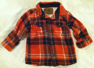
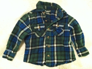
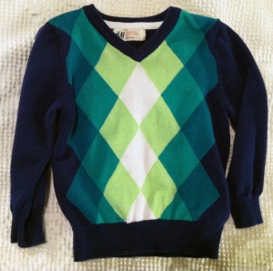
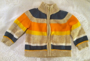
Here are the highlights from today’s treasure hunt:

fleece lined orange flannel

blue & green flannel

blue & green flannel

blue and green sweater

blue and green sweater

zip-up fall sweater

zip-up fall sweater

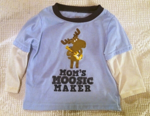
moosic maker shirt

moosic maker shirt

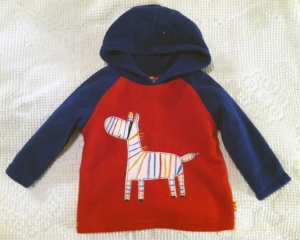
fleece sweatshirt -- new with tags

fleece sweatshirt — new with tags

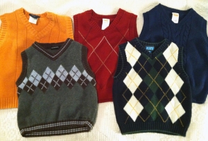
a bevy of sweater vests

a bevy of sweater vests

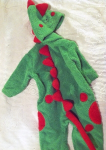
dragon play suit

dragon play suit


All of these were $2-$5 each. Can’t wait for the weather to cool down so we can break out the cute warm clothes!

Review: Copper by Kazu Kibuishi

In our middle school library, which is heavily frequented by boys, there are a few authors whose books never seem to touch the shelves before being checked out again. Chief among them are graphic novelists Jeff Smith (the Bone series), Doug TenNapel (Cardboard, Bad Island), and Kazu Kibuishi (the Amulet series).

I’m always hoping these guys will release another dang book — so when I realized that I’d somehow missed Kibuishi’s 2010 collection of his webcomic Copper, published by Scholastic, I ordered it right away.

I’m not sure what I was expecting from this slim volume with a cute boy and his neurotic-looking but equally cute dog on the cover. What I got was a fantastic collection of short stories and one-page vignettes that demanded more time to read than I’d planned.

Copper is a boy — or is he a man, rendered small to reflect his childlike spirit? — whose sole companion is his dog, Fred. Copper is brave in a a reckless sort of way, and he is also recklessly optimistic. He wants to believe that crazy things are possible. Fred is cautious, worried, and battling an existential crisis. Copper wants to go check things out, and Fred wants to wait and see. The bright-eyed boy tends to get his way, and the result is a quiltwork of adventure and misadventure, both real and imagined.

I tried to read it as a kid and found myself thinking about Calvin and Hobbes, especially in the scenes where Copper and Fred dream themselves into wild escapades. (They seem to have plenty of wild waking adventures as well, and I spent a good portion of this book wondering what was real and what was dream.) If I follow that line of thought, Copper is a grown-up Calvin who has absorbed the best of his tiger friend’s philosophical maturity… and Fred is Hobbes crossed with a healthy dose of Eeyore.

Reading it as an adult, I was drawn in by the surprising depth of emotion captured in the short pieces. Copper often seems chipper and carefree, but his dreams are haunted by a sad girl trapped in a bubble, and his nights and days are painted over a backdrop of loneliness and a yearning for something more. Fred, meanwhile, is wrestling with his sense of his own mortality and his fears that no one cares enough to even notice him. Is Copper’s audacity really a frantic attempt to get to an adult life he fears he’ll never have? Is Fred’s reticence really a half-conscious attempt to slow the march of time? A better mainstream cartoon for comparison might be Family Guy, with its moral underpinning in the forms of canine Brian Griffin.

What you’re wondering is, is this book right for middle school guys (or high school guys, or….)? I submit that the answer is yes. It isn’t necessarily written “for” my rampaging hoards of eleven-year-old boys, but they’ll pick it up and they’ll read it. They won’t understand all of it — they’ll possibly miss the deep stuff entirely as they rush to soak in the gorgeous imagery and daring exploits. But I think seeds will be planted, and if they return to Copper as an older teen, as a man, as fathers — why, I think they’ll find that it’s a pretty dang literary work of sequential art.

(Speaking of art: hands-on types will love Kibuishi’s “behind the scenes” section at the end of the book. It was accessible, entertaining, and illuminating — a great resource for the budding graphic artist.)

Review cross-posted at Guys Lit Wire.

Posting

Well, if you don’t have the password to read my protected posts, you’re probably thinking this is about the most boring blog you’ve ever seen, huh.

Usually I get bored and write (or do other online time-wasting) a lot during the summer, but this summer the opportunity for boredom never really hit me. I was really busy with a lot of different stuff, and thought several times of things I ought to be writing, but never did. In fact, I even slacked off on my weekly reading updates. Oops. 

If you are not a scary creeper person — if I know you in real life, or you’re a mom who likes reading about other peoples’ families, etc. — you can leave a comment (making sure to include your email, which won’t be published or shared) and I’ll happily send you the password to the other posts. They’re mostly just pictures of my little boy and recaps of things we’ve done, and I would love to share them with everyone, but you know how things are these days. I’m trying to save him some privacy. 

And if you have any ideas of something you’d like me to write about, comment with that, too. I tend to do well with assignments… 

Building a Better Yearbook

Last year I took over as the yearbook advisor (adviser? This is one of these words whose ambiguous spelling haunts me) for our middle school.

I love graphic design and bookmaking and yearbooks. I do. And I was once the editor of our school yearbook — our middle school yearbook, when I was in eighth grade. (I started to do yearbook in high school, but the story of that disaster is a whole blog post unto itself.) So sure. Definitely qualified.

Well… let’s just say that we ended the year with a yearbook. And honestly, it’s not bad. Some people even thought it was good. I love the cover art, I love that there are few enough mistakes that no one has brought any to my attention yet (I’m not so crazy as to assume there really aren’t any), and I love that we got it done on deadline.

But there are so, SO many things that I would have done differently. Fortunately I get that chance this year. Some of my thoughts as I forge ahead:

  1. I still am not sure what to do about my staff, but at least I have my applications in hand. I have too many good 8th graders applying and too few good 7th graders, too many girls and too few boys. I can take them all and have an enormous staff; I can cut some excellent applicants in favor of a smaller, more manageable group. I haven’t decided and I’ve had months to do so. Sigh.
  2. I’m not going to ask the staff about the theme. I know what our theme is going to be, I know approximately what the yearbook is going to look like, and I’m not interested in reopening a yearlong debate with fourteen-year-old girls. They’ll still have creative control of their own pages, within reason, but I’m seizing creative control of the cover, dividers, etc.. Someone may complain now, but they’ll thank me in May.
  3. REALLY hoping I can have my yearbook staff at least 1-2 times a week during Advisory… please oh please… will make such a big difference in terms of communication and organization.
  4. I want to highlight some of the previously overlooked groups and activities in the school. There’s a lot going on that gets skipped in the yearbook due to other, “bigger” organizations and lack of pages. But I think I can address that this year.
  5. I need to figure out how to teach rudimentary design to really young designers — specifically the idea of working off a grid instead of plopping down pictures willy-nilly. Last year, I was really in the “let’s just get it done” frame of mind. This year, I want to get it done well. I want them to have learned something by the time they finish it. I want them to have designed something that they’ll be proud of when they graduate high school.
  6. Definitely going to be more conscious of and deliberate about photography. I’m going to do some direct instruction on photography, and now that I’ve unraveled the mystery of the yearbook cameras we’ll have much better equipment. Last year’s photography was a fiasco. This year, I’m going to be proactive and protective.

Speaking of photography! We have one big D-SLR with some good lenses that will probably rarely be in anyone’s hands but my own. Then we have a set of Nikon CoolPix cameras that are sturdy and surprisingly good. I found the Nikon interface a little confusing, so I took the newest one with me on a family vacation to master it before trying to teach its use to students. I’ll tell you what; for a smaller digital camera without the ability to swap out lenses, the CoolPix was pretty impressive! I loved playing with the epic (yes, epic) zoom capabilities; when other people reached for binoculars to spy on distant sea lions, I grabbed my camera instead.

Here’s an example. Check out this sunset photograph I took on August 7 in Bandon, Oregon:

ship1

You may not realize it, but there’s a boat in that picture. Here, I’ll circle it for you:

ship2

See it yet? You can click on the photograph to enlarge it, if that will help.

Anyone who has ever tried to photograph the moon knows that objects appear much smaller through a camera lens. I could see that boat with the naked eye, but it certainly wasn’t clear — just an obviously manmade object, moving slowly along the horizon. I decided to use my camera to get a closer look.

ship3

From this vantage, I had about as much detail of the boat in my camera as I did with just my eyes. So I zoomed in closer. (By the way, none of these pictures are cropped or zoomed in after I took them. They are original files straight from the camera.)

ship4

I love this picture, but I knew I could see more because I hadn’t even started to play with digital telephoto yet.

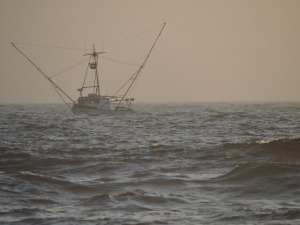
I kept zooming and got this:
ship5

Look at the detail, kids. Look at that. Just look at it. Wow.

And the thing is, I think I could have zoomed in until I saw the people on the boat, if I’d had a tripod. The problem with super duper zoom is that you can’t keep the subject in your viewfinder without steadying the camera, and in this case I had the added problem of a drifting subject. This is one of several different shots I took, each with the boat careening out of view, except this one.

So yeah. I’m pretty happy with these cameras. I think we can do some really good work with them this year. I’m especially looking forward to some good sports and performing arts photography.

And no, Nikon didn’t tell me to write this. But if someone from Nikon reads this and wants to adopt my yearbook staff and give us new gear, I’d be delighted to review it. 😉

Anyway, wish me luck with my yearbook staff and with doing a good job with yearbook on top of my other responsibilities. This is my year when I’m going to kick things up a notch, or at least when I’m going to try. Lots of ideas, lots of blank slates…. whee!